Sydney Space Hack: How an Architect Dad Leveled Up His Son’s 50sqm Apartment
Get ready to see some next-level urban ingenuity. In Darlinghurst, Sydney – a dense, inner-city hub where space is king and usually expensive – architect Ed Litman was given a unique challenge by his son, Mitch, a chef: transform a “pokey and dark” 50 square meter (that’s about 538 square feet for us in North America) warehouse apartment into something truly functional and even, dare I say, luxurious. Ed’s mission, which he chose to accept, was to redefine “doing more with less”. And let me tell you, he absolutely crushed it.
From Warehouse Grime to High-Ceiling Shine
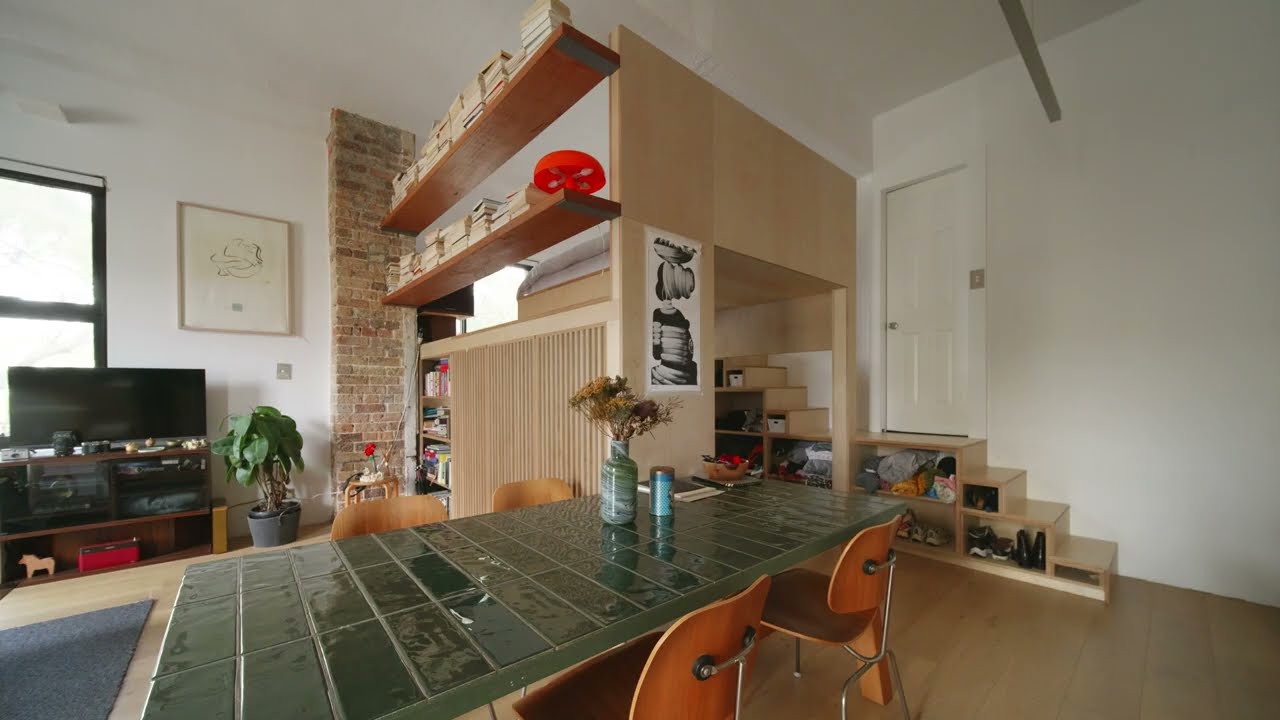
This apartment isn’t your typical cramped city box. It started life as a Reader’s Digest warehouse before being converted to residential use. That history blessed it with a secret weapon: an impressive 3.6-meter (nearly 12-foot) ceiling height. That vertical space was the game-changer. Originally, the place was a bit of a mess: an awkward galley kitchen, an island that ate up precious floor, and an uninspiring, separate bedroom. Mitch’s brief was straight to the point: a killer kitchen, a mezzanine bed, and a design so good it could land on “Never Too Small”. Mission accomplished.
The Genius Move: Elevating the Loft, Elevating Life
The single biggest design play here, the one that unlocked the apartment’s true potential, was elevating the bed loft. This wasn’t just about putting a bed up high; it was about creating a whole new, usable zone underneath it. Thanks to smart planning, there’s ample headroom to walk comfortably under the mattress, effectively boosting the apartment’s usable floor area.
Underneath this elevated sleeping perch, you’ll find some seriously smart solutions:
A cleverly integrated clothing wardrobe.
A dedicated desk space with its own window, which Ed describes as a “nice cozy space” that reminds him of a “caravan or a boat”. It’s essentially another experience carved out within the apartment.
The bedroom itself? It overlooks the living room, giving it a “grand and luxurious” feel.
Storage That Works Hard (and Looks Good Doing It)
Anyone who’s lived in a small space knows storage is always a battle. Here, it’s a seamless part of the architecture. A custom-designed storage wall integrates the kitchen area and extends all the way to the ceiling. This means every available inch is put to work, even for those items you don’t need daily access to. Ed stresses that in an older building like this, where floors and ceilings are rarely level, custom joinery is non-negotiable. For a touch of visual flair, horizontal lines are integrated into the joinery, adding beauty to function. You’ll even find smart storage cubicles under the stairs for shoes, jumpers, and knitwear – no space wasted.
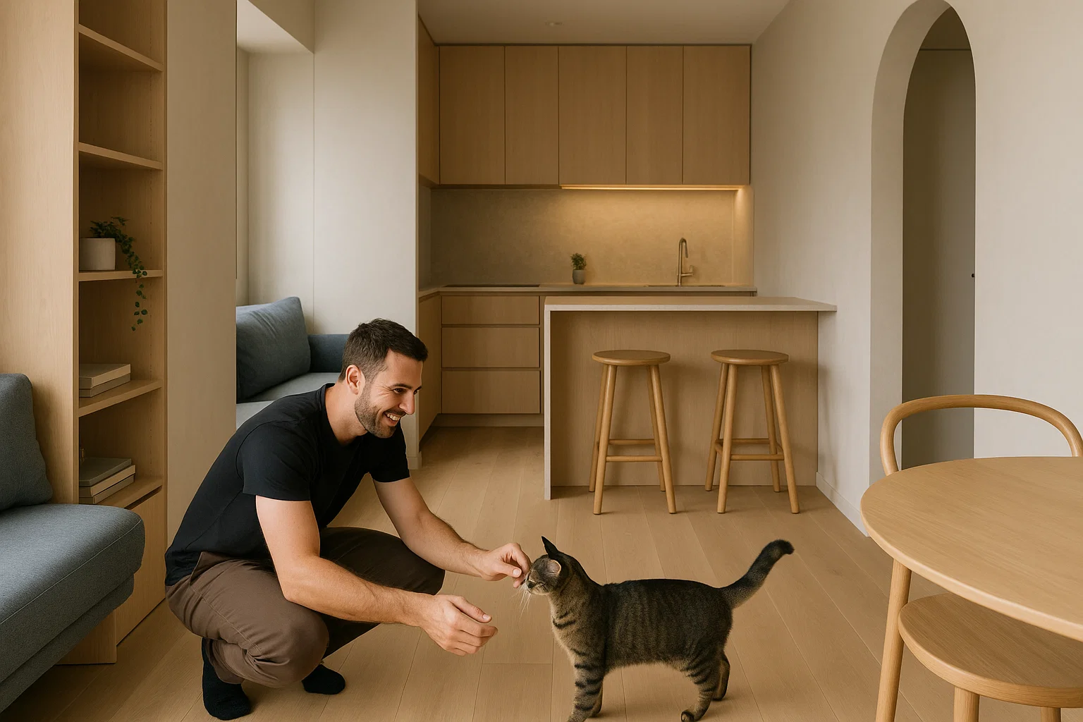
A Chef’s Kitchen & Sustainable Style
For Mitch, a chef, the kitchen was paramount. It features a robust stainless steel bench, a material he’s completely familiar and comfortable with. Instead of narrow, awkward drawers, Ed went for deep, wide drawers – much more practical and easier to access. And here’s a killer trick for small spaces: a mirrored splashback. Not only does it instantly make the room feel bigger, but it allows Mitch to keep an eye on his guests even when his back is turned. Bonus points for sustainability: the gas cooktop was a friend’s discard, repurposed into this new build.
When it came to materials, timber takes center stage throughout the entire apartment. From the new timber floor (replacing old vinyl) to the joinery and bed base, it’s the dominant choice. This isn’t just about aesthetics; timber is a sustainable material that “smells nice” and brings much-needed warmth to the apartment’s clean, minimalist white palette, chosen to maximize the feeling of space. A lot of the furniture, including the table and chairs, was even sourced secondhand by Mitch himself, adding an eclectic, personal touch.
Lighting That Elevates & a Flow That Frees
The lighting strategy is key to the apartment’s open feel. An aluminium uplight throws light toward the ceiling, drawing your eye up and through the space, creating a greater sense of openness. It’s integrated with the joinery, part of the overall service zone.
The apartment’s layout embraces permeability and transparency. Shelving between the living room and study lets light and views pass straight through, keeping things airy. Even the wardrobe isn’t completely walled off, using a timber screen that gives a sense of a room behind it without fully enclosing the space. This design approach works perfectly for a place meant for one person or a couple, where extreme privacy isn’t the primary concern, allowing the apartment to feel like “one big volume” – a true luxury in the city.
This project proves that with thoughtful design and a little hard work, a small footprint can lead to a truly remarkable, practical, and enjoyable home. It’s also a powerful nod to sustainability, showing that converting existing buildings for a new use is far more eco-friendly than demolishing and building new. That’s how you do more with less.