Designing with Intent: How an Architect Dad Crafted a Chef’s Ultimate Urban Loft
Forget everything you thought you knew about living small. In Darlinghurst, Sydney – a neighborhood bursting with energy, restaurants, and shops, where density is the name of the game – Ed Litman, founder of Lipman Partnership, took on a personal and professional challenge for his son, Mitch. The mission? Transform a “pokey and dark” 50 square meter (that’s about 538 square feet for us here in the States) warehouse apartment into a highly functional, utterly delightful, and camera-ready space that could land on “Never Too Small”. Spoilers: he crushed it.
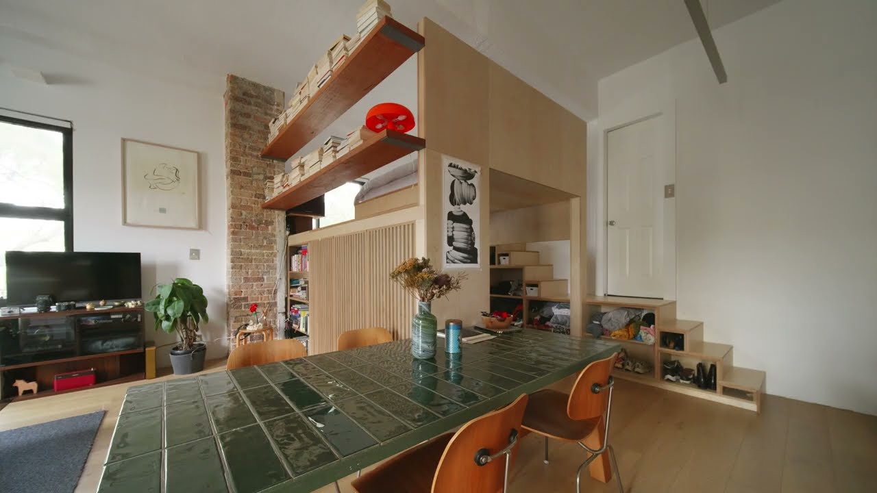
This building was originally a Reader’s Digest warehouse, later converted to residential use, which gifted it a hidden gem: an incredible 3.6-meter (nearly 12-foot) ceiling height. That kind of vertical volume is a designer’s dream, offering boundless potential. The original layout was frankly a mess: a cramped galley kitchen, an island that ate up crucial floor space, and a separate, uninspiring bedroom. Mitch, being a chef, had non-negotiables: a killer kitchen and a cool mezzanine bed. Ed’s design philosophy was clear: “do more with less”, finding the “most simple, practical, and high performance solution” because, as he puts it, “there’s no room for extravagance… there is a need to make the space livable and delightful”.
The Game-Changing Move: Elevating the Loft
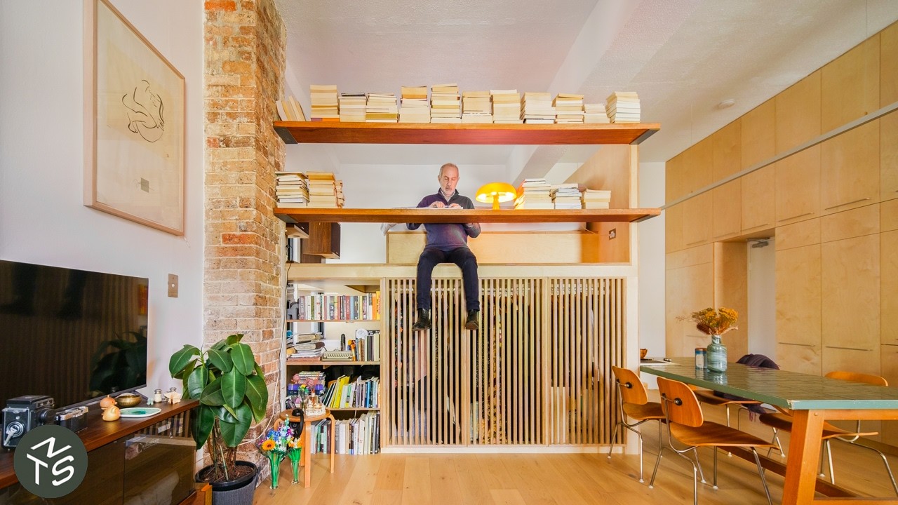
The single most impactful design decision here was elevating the bed loft. This wasn’t just about getting the bed off the floor; it was about creating an entirely new, fully usable zone beneath the sleeping area. By raising the mattress, there’s ample headroom to walk comfortably underneath, effectively increasing the apartment’s usable floor area.
Tucked perfectly into this newly created “undercroft” zone, you’ll find:
A custom-designed clothing wardrobe.
A perfectly proportioned desk space nestled by a window, which Ed describes as a “nice cozy space” reminiscent of a “caravan or a boat” – truly another unique experience within the apartment.
The bed itself enjoys a prime position, overlooking the living room, which gives it a remarkably “grand and luxurious” feel.
Storage So Smart, It Disappears (Almost!)
In any small space, storage isn’t an afterthought; it’s an integrated architectural element. Here, the magnificent storage wall extends from the kitchen all the way to the ceiling, ensuring not an inch is wasted. Those higher sections? Perfect for items you don’t need daily access to. Ed emphasizes that in older buildings, custom joinery is absolutely essential because floors and ceilings are rarely level. To add a touch of visual sophistication, horizontal lines are cleverly integrated into the joinery, which he notes “adds some beauty”. Don’t miss the smart storage cubicles tucked under the stairs for shoes, jumpers, and knitwear – proof that no space was left unutilized.
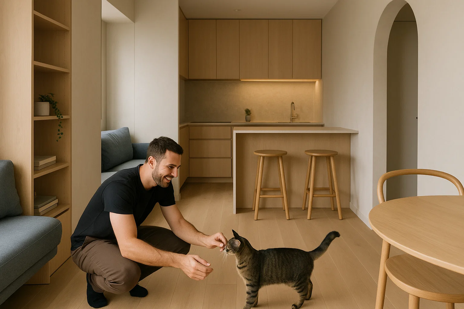
A Chef’s Kiss Kitchen & Thoughtful Materiality
For a professional chef like Mitch, the kitchen was the heart of the home, and it had to perform. It features a robust stainless steel bench, a material Mitch is completely comfortable working with. Instead of narrow, awkward drawers, deep, wide drawers were chosen for ultimate practicality and easier access. And for a truly brilliant small-space hack: a mirrored splashback! Not only does it instantly make the room feel bigger, but it also allows Mitch to keep an eye on his guests even when he’s got his back to them. Bonus points for sustainability: the gas cooktop was a friend’s discard, repurposed for this build.
When it came to the overall material palette, timber is the undeniable star. It’s used for the new timber floor (replacing original vinyl), the joinery, and even the bed base. This wasn’t just a style choice; timber is a sustainable material that “smells nice” and brings essential warmth to the clean, minimalist white palette chosen to make the space feel as expansive as possible. Even much of the furniture, including the table and chairs, was cleverly sourced by Mitch himself, adding an eclectic, personal touch.
Lighting That Elevates & Flow That Frees
The lighting strategy is pure genius, designed to make the space feel even larger than its footprint. An aluminium uplight directs light towards the ceiling, literally drawing your eye up and through the apartment, creating a heightened sense of openness. It’s positioned to be parallel with the joinery, making it a cohesive part of the overall service zone.
This apartment is all about permeability and transparency. Shelving between the living room and study ensures light and views can pass through, maintaining an open, airy feel. Even the wardrobe isn’t completely walled off, utilizing a stylish timber screen that gives a “sense that there’s a room behind there” without fully enclosing it. This approach is perfect for a space designed for one person or a couple, where extreme privacy isn’t the primary concern, allowing for a more luxurious “one big volume” experience.
Ultimately, this project is a shining example of how innovative design can transform even the tightest spaces into something truly practical, livable, and utterly enjoyable. It’s also a powerful nod to sustainability, proving that converting existing buildings is often far more eco-friendly than starting from scratch. It’s a powerful reminder that with vision and a little hard work, a small footprint can lead to a huge impact!