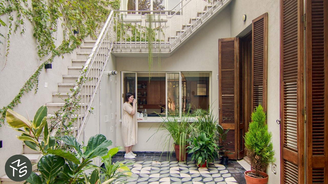
Architect Dad’s Sydney Loft Transformation
In the bustling inner-city neighborhood of Darlinghurst, Sydney, where space is a luxury, one architect dad, Ed Litman, has redefined what’s possible in a compact 50sqm (538sqft) apartment. Tasked by his chef son, Mitch, Ed embarked on a renovation that champions the philosophy of “doing more with less”, turning a once “pokey and dark” warehouse conversion into a remarkably livable and delightful home.
From Warehouse to High-Ceiling Haven
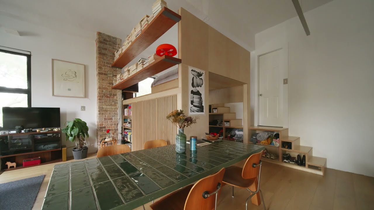
This apartment, originally a Reader’s Digest warehouse, boasts an impressive 3.6-meter (approximately 11.8 feet) ceiling height—a crucial asset in its transformation. The initial state was far from ideal: a galley kitchen, an island that cramped the space, a separate bedroom, and “ugly light fittings”. Mitch’s brief was clear: a great kitchen, a mezzanine bed, and a design worthy of “Never Too Small”.
The Game-Changing Loft and Strategic Storage
The most significant architectural move was elevating the bed loft. This wasn’t just about moving the bed; it was about creating an entirely new, usable zone beneath it. This ingenious solution not only increased the usable floor area but also ensured sufficient headroom for walking under the mattress. Below, you’ll find a cleverly integrated clothing wardrobe and a desk strategically placed by a window, offering a cozy “caravan or boat-like” study experience. The bedroom itself grandly overlooks the living room, adding a sense of luxury.
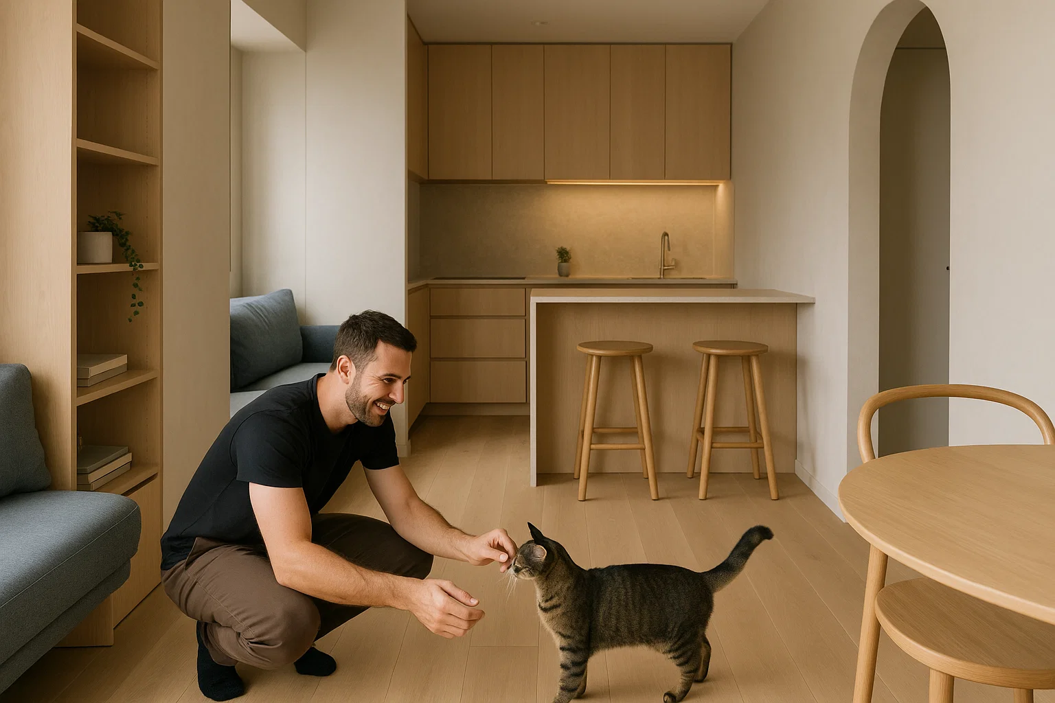
Storage, often a challenge in small spaces, is masterfully handled here. A custom-designed storage wall seamlessly integrates the kitchen and extends all the way to the ceiling, utilizing every inch for both daily essentials and less-frequently accessed items. Ed emphasizes the importance of custom joinery in older buildings where floors and ceilings are rarely level. For visual appeal, horizontal lines are integrated into the joinery, adding a touch of beauty.
Chef’s Kitchen and Smart Material Choices
For a chef like Mitch, the kitchen was paramount. It features a practical stainless steel bench, a material Mitch is accustomed to. Instead of narrow drawers, deep, wide drawers were chosen for easier access and practicality. A stroke of genius for small spaces is the mirrored splashback, which not only makes the room feel bigger but also allows Mitch to see his guests even when his back is turned.
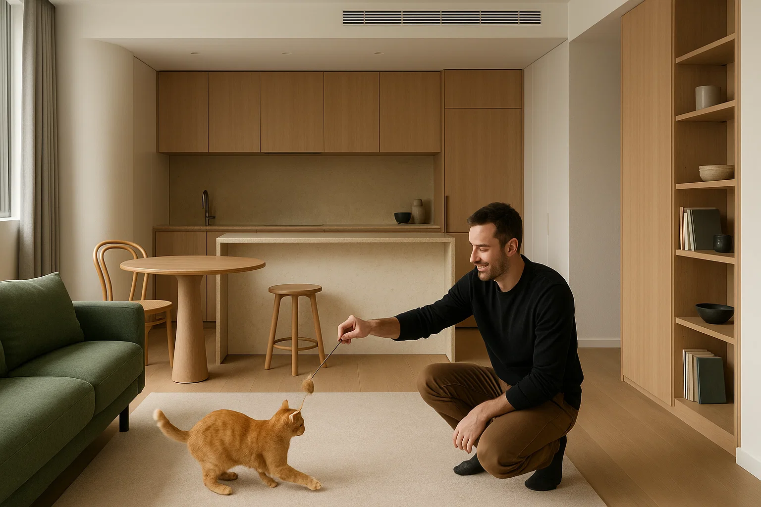
The design embraces simplicity and high performance. Timber is the dominant material choice throughout the apartment—from the new timber floor, which replaced the original vinyl, to the joinery and even the bed base. This choice wasn’t just aesthetic; timber is a sustainable material that “smells nice” and brings warmth to the minimalist white palette, which was chosen to make the space feel bigger.
Layered Lighting and Seamless Flow
The lighting strategy is key to enhancing the sense of space. An aluminium uplight throws light towards the ceiling, drawing the eye through the apartment and creating a greater feeling of openness. This light is positioned parallel to the joinery, making it part of the integrated design.
The apartment’s layout promotes permeability and transparency. Shelving between the living room and study allows light and views to pass through, maintaining an open feel. Even the wardrobe isn’t completely walled off, with a timber screen providing a sense of a room behind it without fully enclosing it. This approach is ideal for a space designed for one person or a couple, where extreme privacy isn’t always the top priority, allowing for a more luxurious “one big volume” experience.
Ultimately, this project is a testament to the power of thoughtful design in creating practical, livable, and enjoyable spaces, proving that hard work in a small footprint can yield truly remarkable results. It also highlights a sustainable approach to urban living: converting existing buildings is often more environmentally friendly than new construction.